Styling Series: How to Choose Cushion Colours

Today, we’re diving into the colourful world of cushions — and most importantly, how to make them work in your space. Fiona Gould is lending us her interior styling expertise to take some of the guesswork out of how to choose the right cushions for the bedroom, and to hopefully inspire you to have some fun bringing out your colourful side.
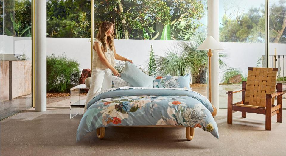
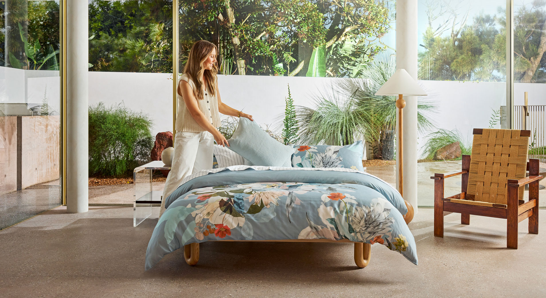
For this Styling Series instalment, Fiona’s source of inspiration is our Brielle Quilt Cover. Brielle features a statement floral print with plenty of colour pops throughout — making it an ideal playground for experimenting with colour. These same tips will apply if you have another statement piece in your bedroom, like a bold rug or an artwork. When you add cushion colours into the mix, you'll immediately notice it starts to pull out the colours from the print. So, let’s begin.

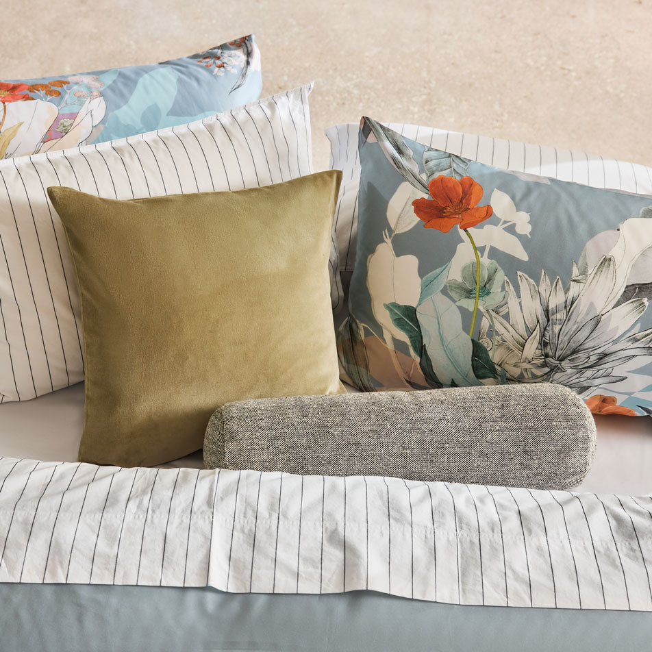
Look One: Play with Statement Colours
If you're a fan of statement looks, try experimenting with contrasting colours. For our Brielle Quilt Cover, this would be those warm reds that really stand out against the icy blue base.
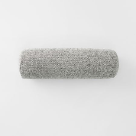
Fiona’s styling tip: Choose one bold statement piece. In this case, it’s the Adman Square Cushion in the colour nectar — a bright coral red. Since this is already quite a statement, Fiona recommends adding in some lightness, like a white or neutral. The Kirwan Square Cushion in relish is perfect for this, with its light base and bright red stitching on the border to tie into the look.
The trick here is balance. You want to make the colours in your quilt cover pop by adding just the right amount of colour. Too much bright colour can overwhelm the eye — but the right amount will make those colours sing.
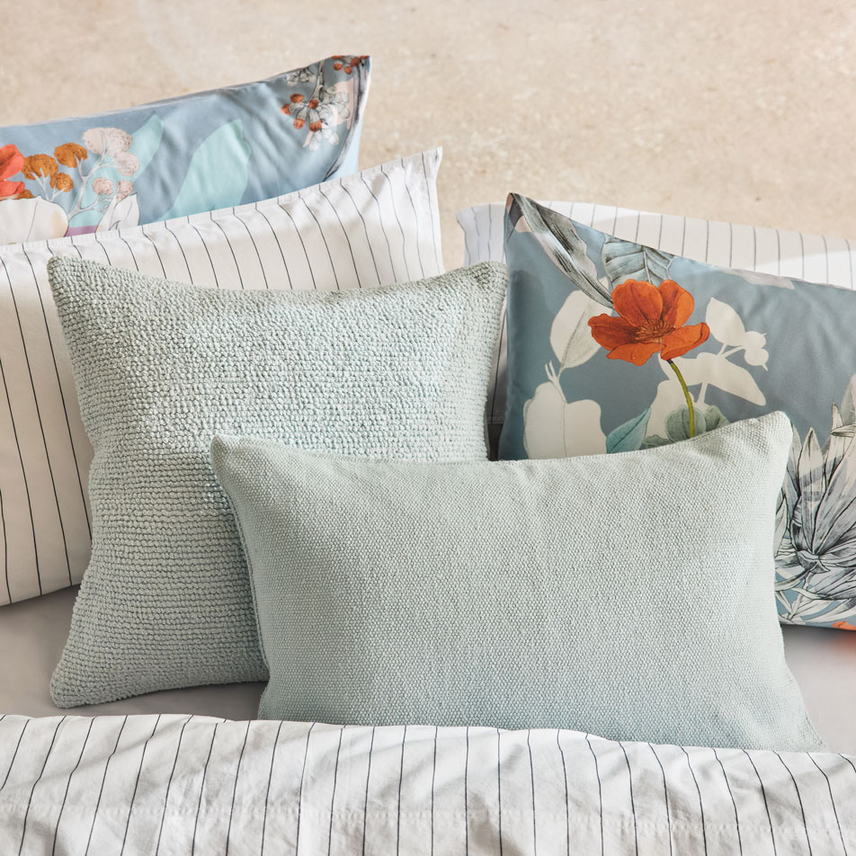
Look Two: Embrace Tonal Colours
If you're a fan of subtlety and gentle layering, styling with tonal shades is for you. For this look, we’re focusing on colours that complement the light blue base of our quilt cover.
Fiona’s styling tip: Keep it simple. Take the base colour of your quilt cover (or whatever else serves as your styling inspiration here) and mix in similar shades of that same colour. For our Brielle quilt cover, this will help pull out those baby blues and let this print be the hero of our look.
Fiona has chosen the Tomek Square Cushion and Adman Breakfast Cushion both in the colour ice. The colour may be the same, but by mixing two different shapes and textures, we’re still adding a nice pop of dimension to our bed.


Look Three: Combine Cool & Warm
For 2025, maximalism is here to stay. We’re talking colour, pattern and texture — and lots of it. Unexpected combinations reign supreme in this optimistic trend, achieved through a healthy amount of layering. When it comes to styling maximalism in the bedroom, think mismatched sheets, printed pillowcases and complementary cushions. Throw in a statement side table, rug or bed head and you’re well on your way to the eclectic bedroom of your dreams. In fact, according to Pinterest Predicts, searches for phrases like eclectic maximalism and eclectic apartment are up by more than 200% – 600% respectively. We love this trend not only for its bright and joyful feel, but because it lends itself to more opportunities for self-expression in our homes.
According to Elle Décor, interior designers are prioritising personal expression more than ever. After all, doesn’t it make sense that our homes should reflect our personalities? Whether it’s through one-of-a-kind pieces or unique styling choices, we’re seeing a rise in interiors that fit into our lifestyles and personal taste, rather than chasing a singular aesthetic.

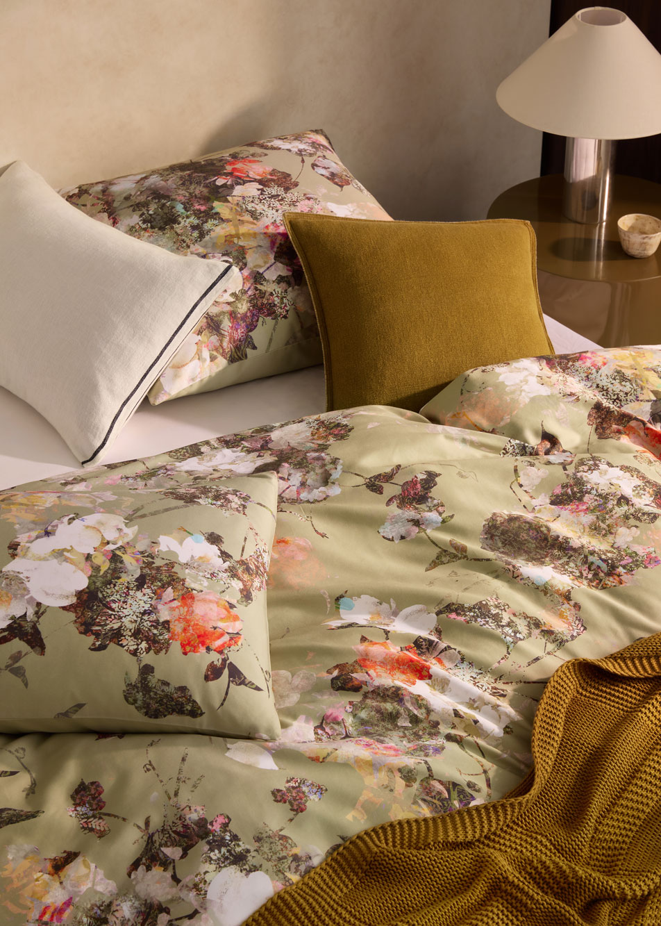
Look Three: Highlight the Smaller Details
For our final look, Fiona has pulled out two of the subtler tones in the Brielle design — the soft greens from the foliage and the charcoal black from the outlines. By choosing to highlight the more unexpected colours in your statement piece, you can totally shift the focus of your colour story.
Fiona’s styling tip: When pulling out colours from your quilt cover, try accessories in lighter shades of that colour rather than an exact colour match. Here, Fiona has softened the black by opting for an ebony marle in our Tami Bolster, paired with the Tessino Square Cushion in a calm and grounded thyme green.
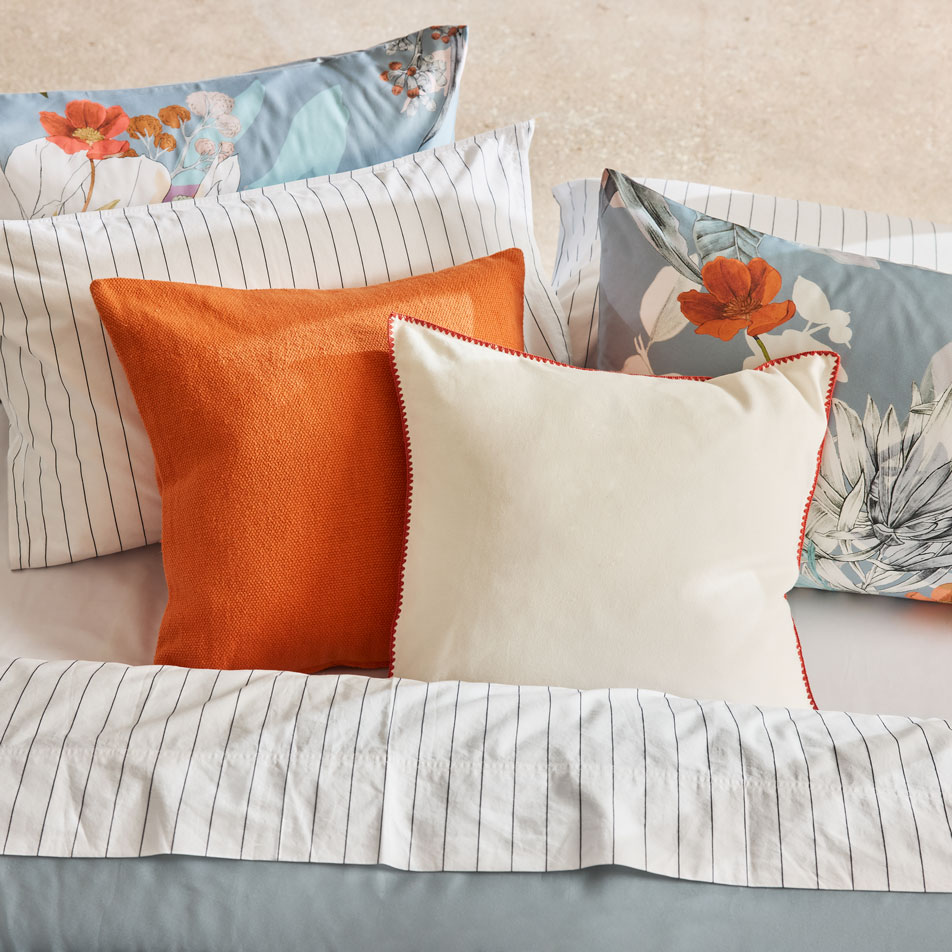
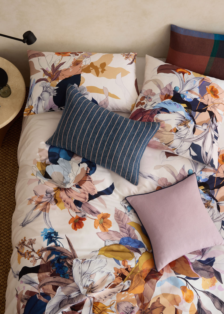
Look Four: Dare to Pattern Clash
Playing with patterns may feel more intimidating than other styling methods, but done correctly, it can result in a stunning and eclectic bedroom look.
Sterwell Breakfast Cushion in raisin: For our pattern clash look, we’ve opted to play with different prints and scales. Sterwell’s oversized check creates instant impact, while the large-scale design keeps things from feeling too busy or overwhelming.
Sano Linen Breakfast Cushion in dark denim: On the other end of the spectrum, we’ve opted for a fine stripe with Sano. Much like the delicate linework and bold colours of our Brielle Quilt Cover, this combination of fine stripes and bold checks plays off one another wonderfully.
Ostan Cushion in dusty mauve: The addition of a plain dye cushion gives the eye a place to rest among the pattern play. But of course, we couldn’t resist revisiting that playful pop of colour.

When it comes to styling cushions in your bedroom, the most helpful tip is to not be afraid to experiment. Whether you’re pulling from the base colours or the contrasting shades in your inspiration piece, have fun trying out different combinations of colour, size and texture until you find a look that you love.