Discover the Inspiration Behind the Sheridan Kids Collection
we chat to bec burnard, senior design manager, about all things kids.
You’ll often hear people — adults — talk about “working out a different part of their brain.” When it comes to designing for children, however, it’s less about a different part and more about a different brain altogether. Or, at least, a whole new mindset...one that travels back (just a few) years in time.
Or as Sheridan Senior Design Manager, Bec Burnard, says, designing for children involves jumping into a “younger outlook on the world” — something she calls both refreshing and playful.
So how does this licence to design with more fun come about? We spoke with Bec to find out.

tell us about the inspiration behind the kids collection
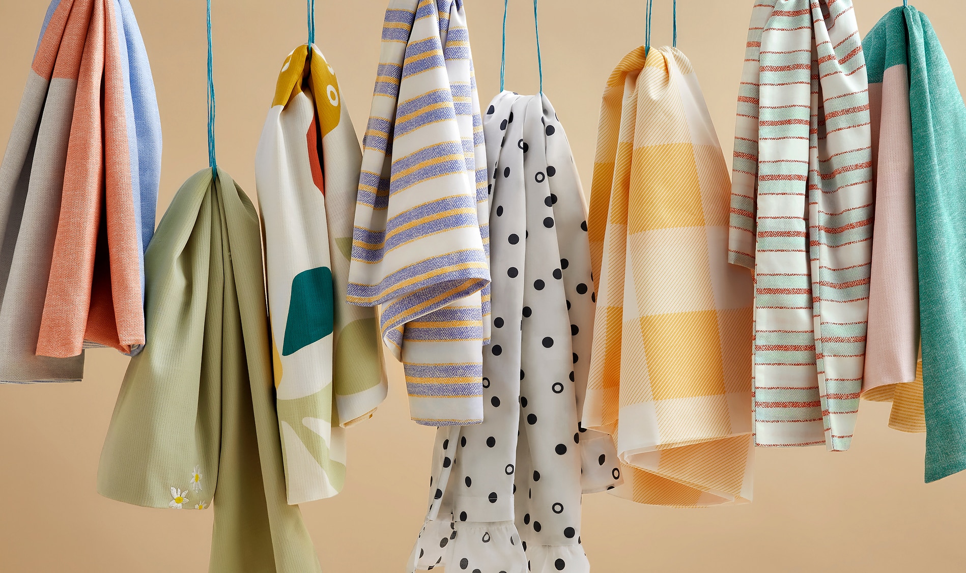
With our kid’s collection, we took a fun, looser, more playful approach, but still making sure there were options for any and every kind of kid. We ended up going for unexpected combinations of colours, prints and textures — something that evokes happy memories from the past and reminds you of the familiar.
how does designing for kids differ from designing for adults?
It’s refreshing to jump into a younger outlook on the world and be more playful — it’s a whole different approach.
For this collection, we took inspiration from all over: colour combinations, vintage kids shirts, kids rooms from the past that made us nostalgic. We updated it by applying a modern lens — experimenting more with saturated colour combinations, adding touches of novelty and considered details.
were there any specific elements you wanted to incorporate?
There were a few! Firstly, patterns — specifically, the type of pattern that works hard, and can be mixed together in all sorts of combinations.
Colour is key when designing for kids. Not only did we want bold colour combinations that could be styled together, but we wanted some subtle and softer options too. It’s all about unexpected colours, a touch of surprise with styling.
how did the quilt cover designs come about?
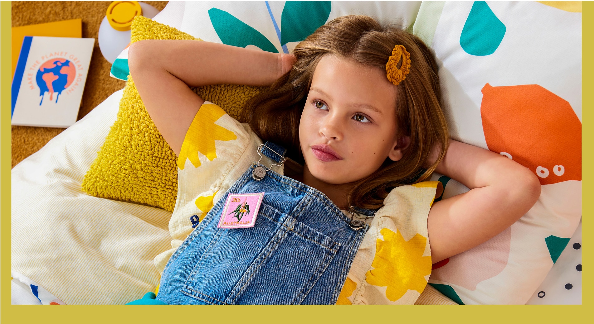
With Fruit Salad, our Textile Designer Clare came up with the fun combinations of fruits mixed in with flowers and foliage. Printed onto textured cotton, in a really vibrant colour palette, it adds an extra dimension to the print.
Daisies really reminded us of summer picnics and picking flowers in the garden as kids. The embroidery just adds to it and makes you feel like you’re sitting amongst the flowers. Extra cute when styled with the Picnic Check Sheet Set.
Colour blocking is evident with Mateo, and offers a change of scale to our other quilt cover designs this season. It makes for fun styling options for kids to experiment with.
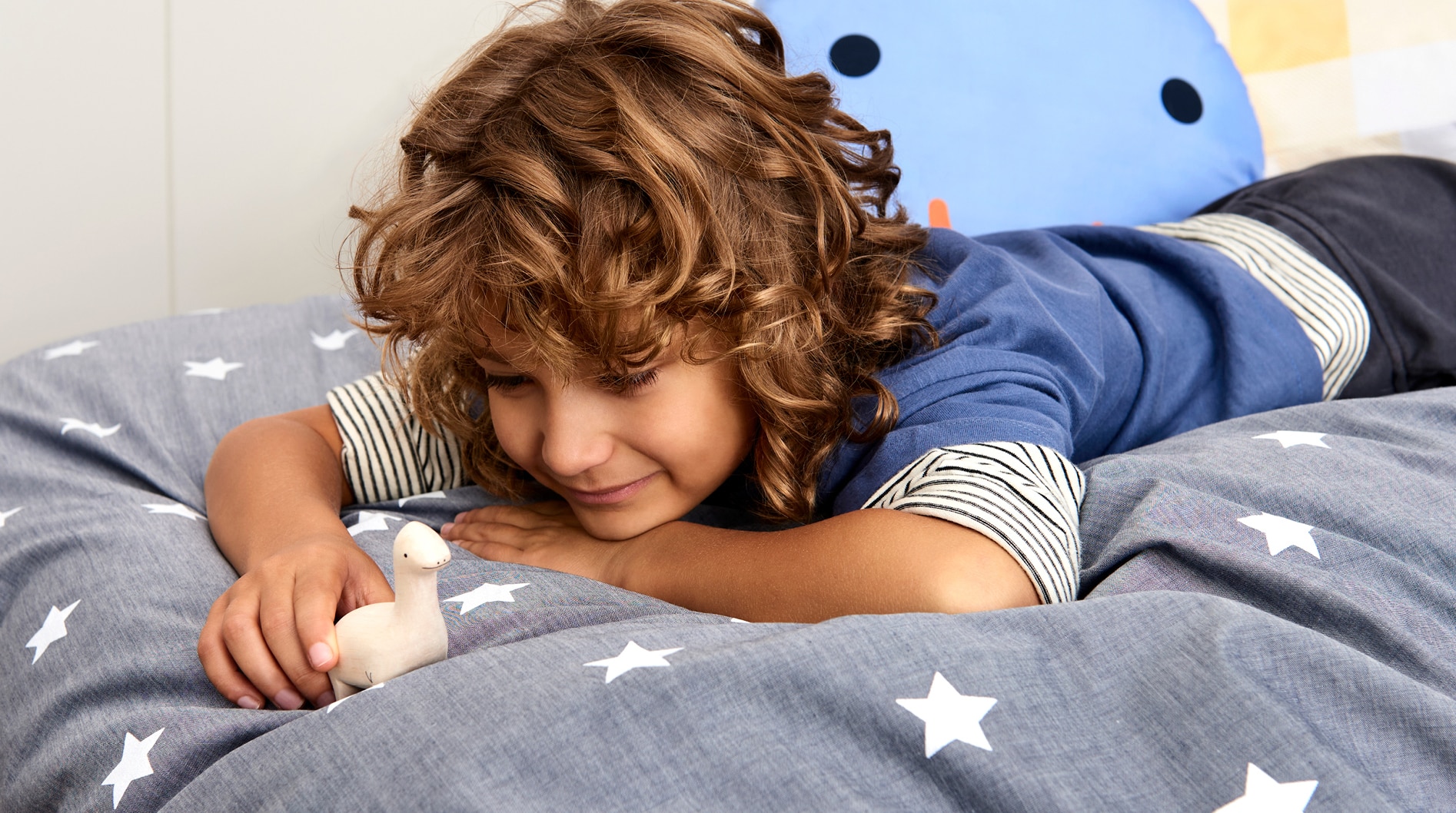
And Pye, a cotton chambray, has a great visual texture, and we’ve added a twist with a bold star print. This is a contemporary classic, it has so many different ways of styling for lots of different personalities.
what are fun ways to style the collection?
We want kids to have fun with styling! Adding lots of casual layers, mixing up print and textures, experimenting.
how has the collection aligned with Sheridan sustainability goals?
It’s important that our approach to designing the kids collection is thoughtful, reflecting our commitment to our sustainability goals. We design with longevity and utility in mind, using beautiful quality fabrics. This season we have reusable packaging — we developed the reusable organic cotton tote bags for this collection, that can be used by kids on many adventures to come.
and finally, is there any piece from the collection you see as...a favourite child?
Well, to continue with the puns — I have a soft spot for the Spotty Frill Sheet Set. I love the combination of the monochromatic spots with the frill on the pillowcase, it really adds fun to styling the quilt cover.