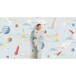
How to Style Colourful Linen Bedding

Our latest season invites you to experiment with opposites — including contrasting colours.

From Pantone to Pinterest to… well, us… the year ahead is going to be a colourful one. Pantone’s declared the colour of 2022 to be “Very Peri” — a new colour, blue with violet-red undertones that “displays a spritely, joyous attitude and dynamic presence.” 

Over on Pinterest, they’ve declared dopamine dressing as a trend to watch out for; where people are expressing themselves with vibrant outfits and colourful palettes. We’re talking from rainbow to fuschia to electric blue.

As for us? With Harmony of Contrasts, our Autumn/Winter ‘22 Collection, we’re inviting you to experiment with opposites in the one look. It might not work on paper, but it’ll work within your home.

Not only is colour a key trend, but contrasting ones even more so. Think seasonal shades of warm greens, bitter chocolates, rich taupes with sunset hues, jewel tones, and accents of blue and green across your bedding.

You could even think all of the above… in the one collection.

Meet Levitt —a multi-coloured offering from our Abbotson Linen collection, that’s all about statement colour blocking. With digitally printed panels, cool colours play off warm faded shades. Crafted in 100% Belgian flax linen — a fabric you know and love — what greater way to bring life to your bed linen, and your bedroom? 


If you’re wondering exactly how to style it, or you need more advice on styling colourful linen bedding, you’ve come to the right place. Here are three ways to style your linen sheets and quilt covers.


#1: Bold Linen Layering

Make your bed the focal point of the room, with the Levitt sheet. With a multitude of colours to choose from on the one offering, you’re able to select a favourite shade — or two — to continue across your bed linen

For a warmer look, choose a shade like granita, sandcastle, maple or cumin across our Abbotson linen bed sheets, both flat and fitted. If you’ve always swayed towards cooler tones, consider linen sheeting in ink, silver, carbon or olive.

Remember that layering doesn’t have to stop with your linen sheets — from pillowcases to shams to cushions to European pillowcases, you can add more bold linen colours to your collection. To keep it complementary, choose the same shade as your sheets. 

Not scared of contrast or clashing? Choose colours that oppose one another. You can go warm when you went cool before, or even choose two different warm shades, or two different cool ones. 


#2: Pare Back With Neutrals

If you’re a fan of our Levitt range, but you’re not quite ready to commit to styling an entire bed in bold colour, we have styling options available for you too.

It’s as simple as paring back the colour palette. And by pare back (no, not pair back), we mean introducing neutrals throughout the rest of your linen bedding; letting Levitt stand on its own.

White bedding is a classic neutral, crisp and clean. For something slightly softer, we recommend flax; a lighter shade. If you want something with a subtle hint of colour that won’t overwhelm, clay acts as a neutral with earthy overtones.

If you want neutrals to take the lead, and just have Levitt as a singular bold statement, we recommend styling with a bed cover and bed skirt.


#3: Mix & Match Linen Colours

It’s easy to play with colour when it comes to linen. Whether combining two colours, or braving out with three or four, here are some easy, and beloved, combinations.

Neutrals + Any Colour: Neutrals are perfect for pairing with stronger colours on offer. Think white, flax and clay linen bed sheets folded over a colourful Abbotson quilt, with matching colourful pillowcases.

Multi-Neutral: If you’ve always leant towards white bedding, but you’re wanting to dip a single toe into the pool of styling coloured linen, we recommend starting with all our neutrals — on the same bed. Think a white fitted sheet, flax flat sheet, and clay quilt cover. Consider two sets of pillowcase pairs, each in a different shade of neutral, with the third shade on a sham.

Warm Colours: Looking to keep it all in the same tonal family? Consider a combination of our warm colours. For sunset shades, pair granita and maple. Cumin is a bold warm shade, that works well with granita, reminiscent of blooming florals. 

Cool Colours: Calming yet sophisticated, with our cooler shades. Ink, a dusty mid-tone blue pairs brilliantly with the dark deep shade of carbon. Another strong colour to mix and match with carbon is olive.  For something a little lighter, look to silver, which works well with ink.


Warm & Cool: Feel free to play with colours from opposite ends of the spectrum, for something a little daring. For something bold, start with the confident colour maple, and add elements of ink. Cumin, with its slight spice, stands out against carbon. For fans of green bedding, olive is a versatile dark green, which works well with cumin.

There’s no right and wrong way when it comes to styling linen — a relaxed and refined fabric, it’s a forgiving texture. So what are you waiting for? It’s time to create an easy, eye-catching look with your linen bedding, with the help of our Abbotson collection. 


2 years ago